Press and brand
One line of light.
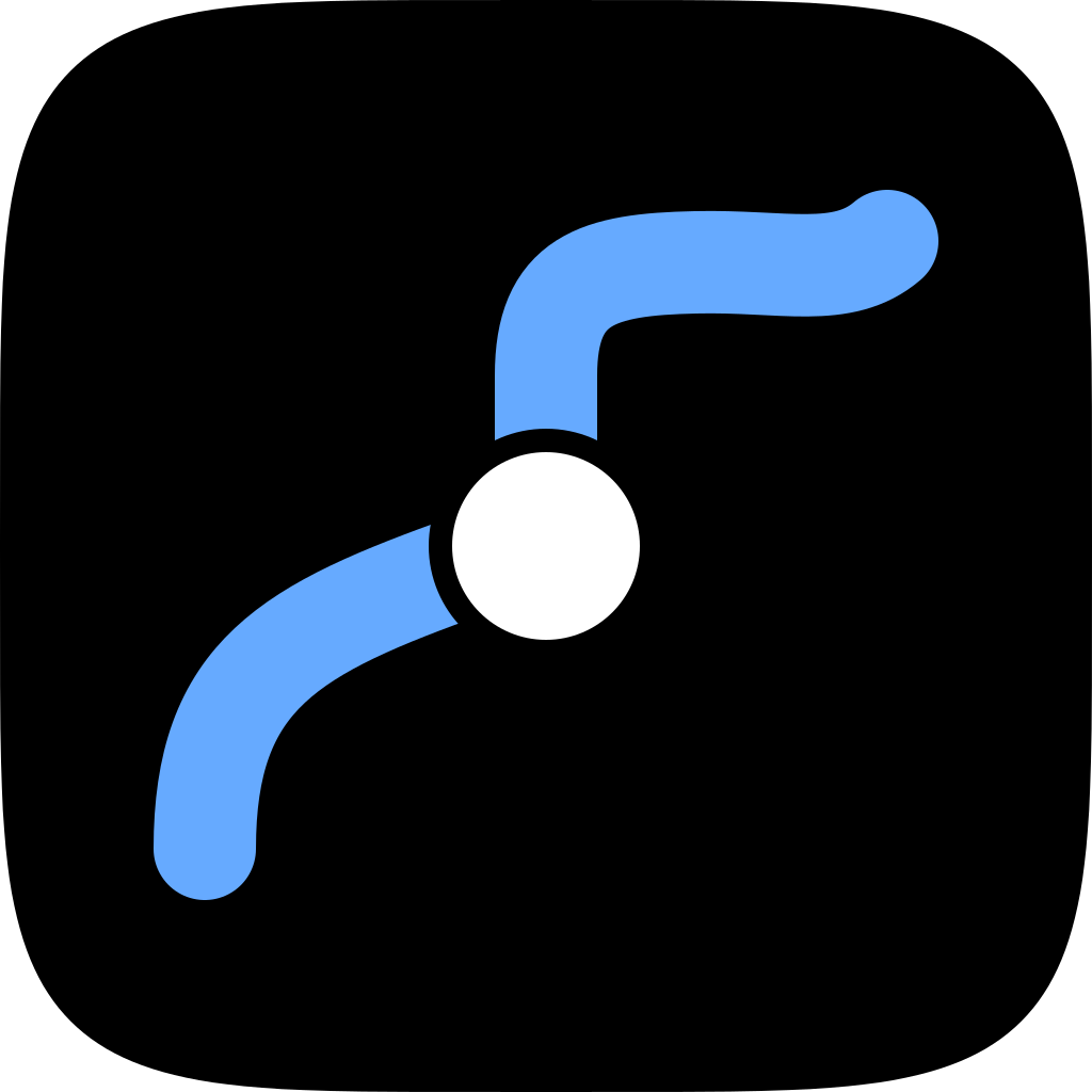
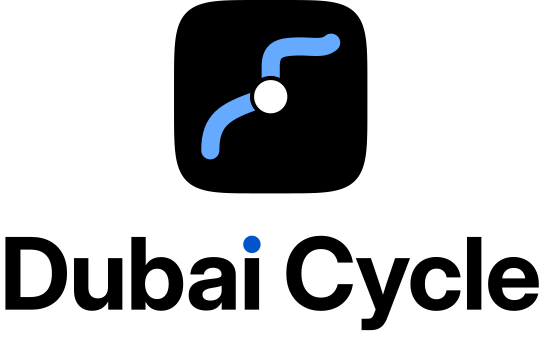
The mark is the app icon: a cycle track as one blue line on the night, and a white disc where the rider is. Blue means where a bike may ride, and it is the only colour in the logo.
The symbol is the working version of icon direction A and waits for the owner's sign-off. Use the files below as they are.
Symbol

Wordmark and lockups
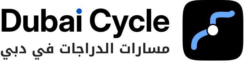
The wordmark is drawn, not typed: Dubai Cycle in a heavy grotesque close to the app's SF Pro, tracked tight, with the dot of the i replaced by a disc in track blue: the same blue as the line in the symbol, and the only colour in the name.







Rules
- Clear space. Keep one cap height of the wordmark free on every side of a lockup.
- Minimum size. Symbol 16 px (use the 16 px file below 24 px); horizontal lockup 96 px wide; stacked lockup 64 px wide.
- Colours. Night track blue #66AAFF on dark, day track blue #0055CC on light, black, white. No other colour, no gradient, no outline.
- The name. Always Dubai Cycle, in Latin letters, on both pages. The Arabic lockup adds a descriptor; it does not translate the name.
- Do not stretch, rotate, recolour, add a bicycle, a skyline or the RTA logo, or set the name in another font.
- Not affiliated. Dubai Cycle is an independent app, not affiliated with the RTA, the Dubai Sports Council or the Government of Dubai.
Clear space and smallest sizes
 CCCC
 16 px96 px
 64 px
Colour and type
- Track, night#66AAFF
- Track, day#0055CC
- Walk#FFDD00
- Ink#000000
- Paper#FFFFFF
Blue is the brand. Yellow belongs to the map: it marks where you walk the bike, in the app and on this site, and is never part of the logo.
Type: SF Pro and SF Pro Rounded in the app; on the web, the system face, with Inter where there is none, and Noto Kufi Arabic for Arabic.
Files
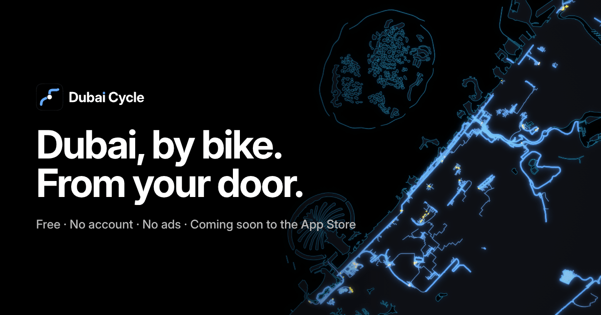
- Share card, English (1200 × 630)
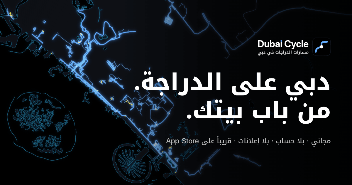
- Share card, Arabic (1200 × 630)
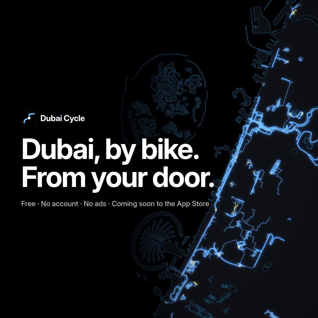
- Square card (1080 × 1080)
- Icon 512 · maskable 512 · touch icon 180



Press questions: [email protected]